A little closer
to wonder.
AERUNE. A Canadian point of view,
from the first mark to the final frame.
Less between you
and the extraordinary.
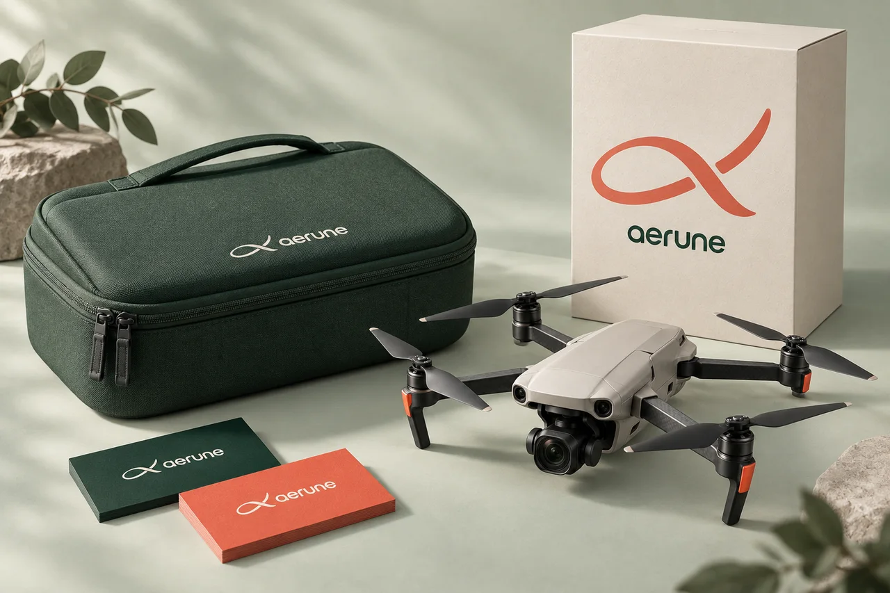
AERUNE lives where considered technology meets an instinct to explore. A flying camera that feels familiar. A point of view that feels entirely your own.
Rooted in Vancouver’s meeting of coast, forest and mountain, the identity pairs a warm human voice with precise, understated design.
- Home
- Vancouver, Canada
- Category
- Camera drones
- Product family
- Mini · One
- Creative direction
- Prix Studio

One continuous thought.
An open loop. A lifted tip. A sense of forward motion without a hard edge. The flight mark brings the idea of a new perspective into one simple gesture.
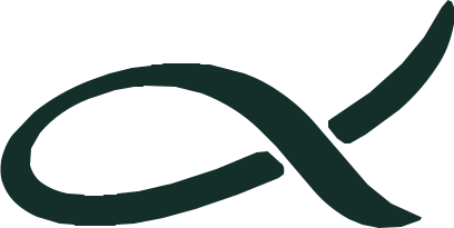 The standalone markReversed identityWith a little warmth
Space is part
of the identity.
Keep one mark-height of clear space around the lockup. Use the complete logo when space allows, and the flight mark when it does not.
Minimum width: 120 px for the logo.
Minimum width: 24 px for the mark.
Keep the proportions. Let it breathe.
From where
we look out.
Pine and glacier. A soft mineral canvas.
A moment of coral, like the first light.
Quietly confident.
Naturally human.
Manrope. An open-source variable sans serif.
A clean technical foundation, with a softer side.
abcdefghijklmnopqrstuvwxyz
0123456789 &!?@
A different
perspective.
There is more
to discover.
We make room for the experience. Clear language. Familiar gestures. A little curiosity in every detail.
A little less noise.
A little more meaning.
Warm, clear and curious. We speak to the person behind the controls. We favour the invitation over the instruction, and the detail over the superlative.
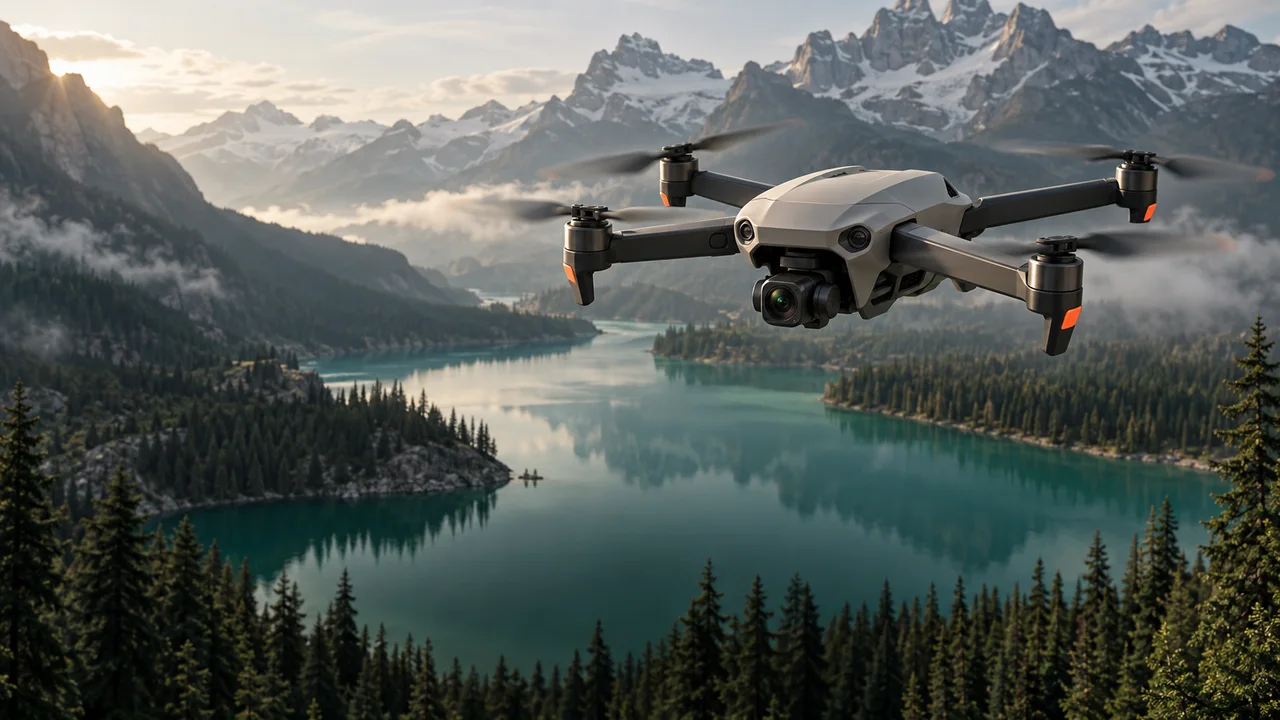
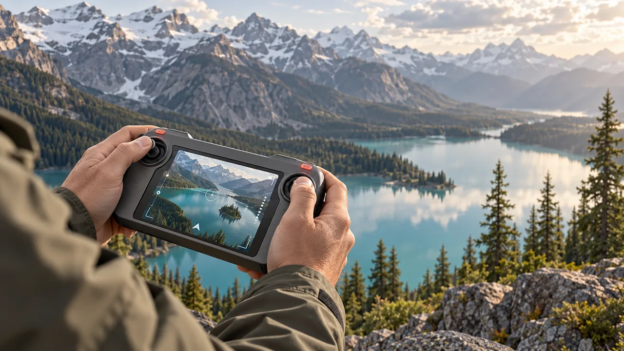
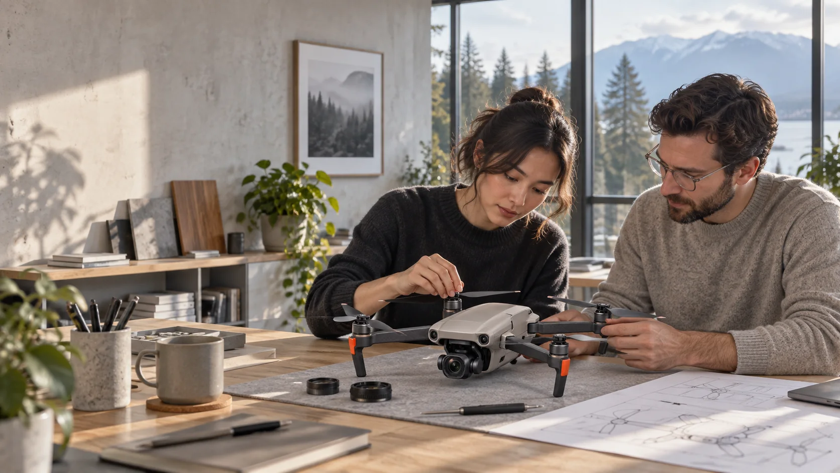
Real texture.
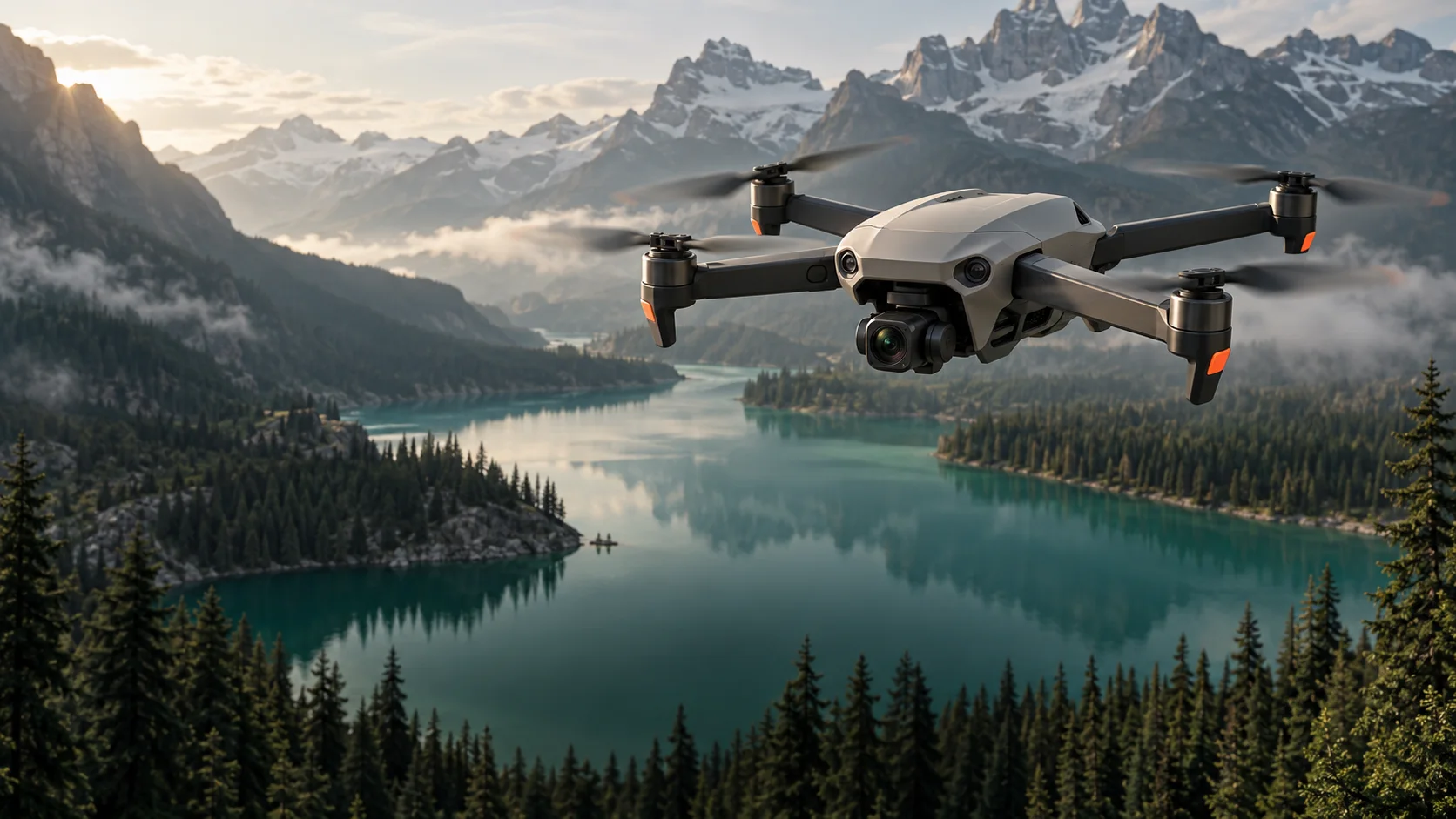
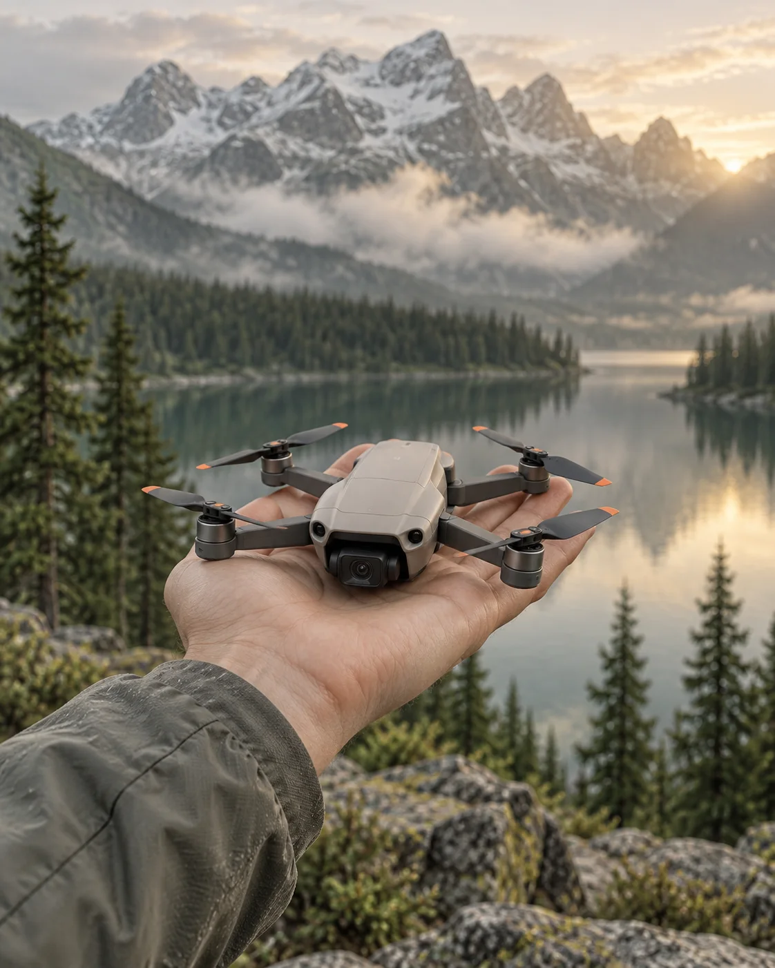
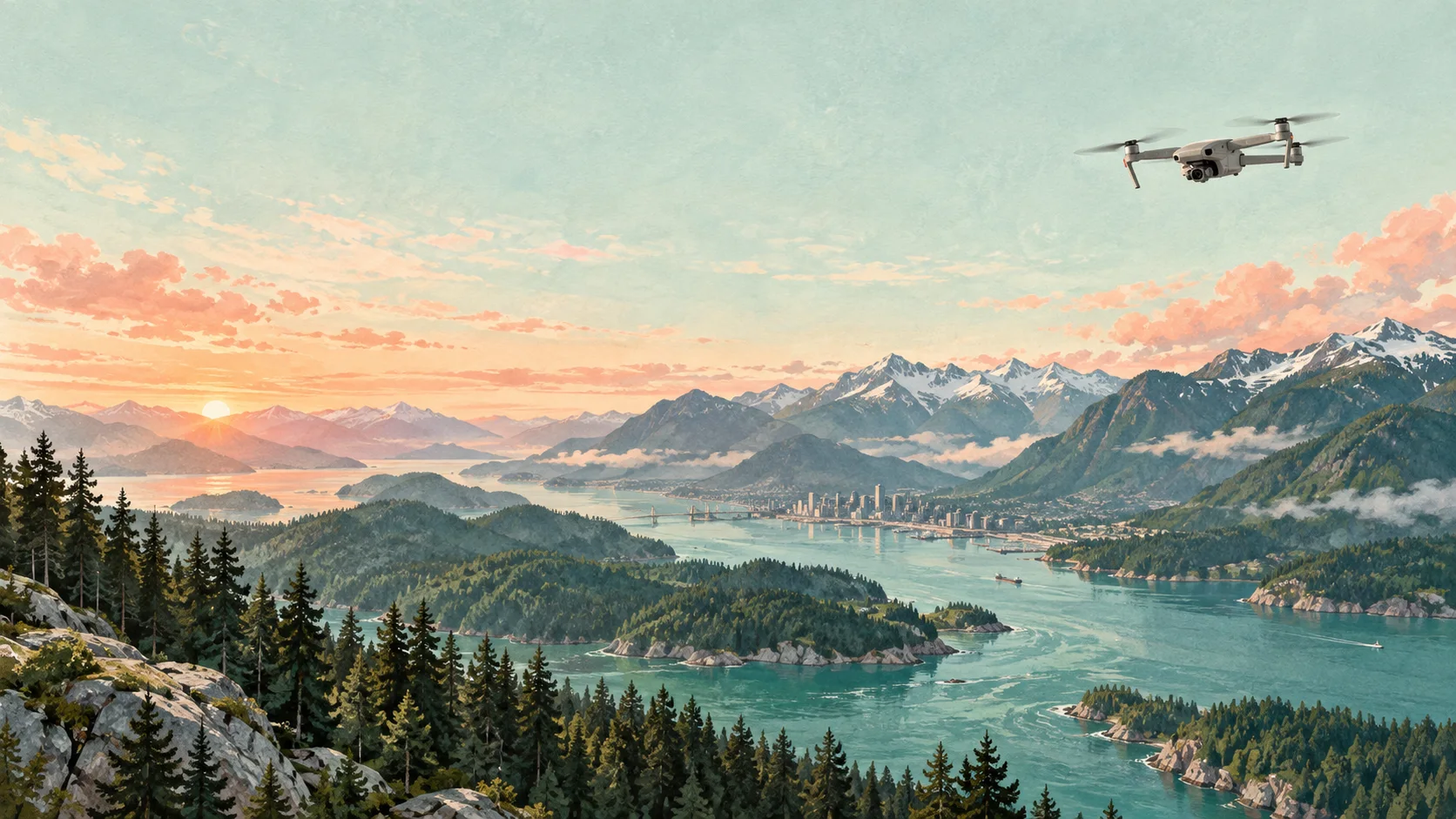
A sense of place.
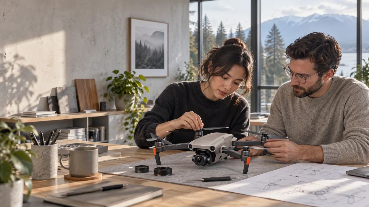
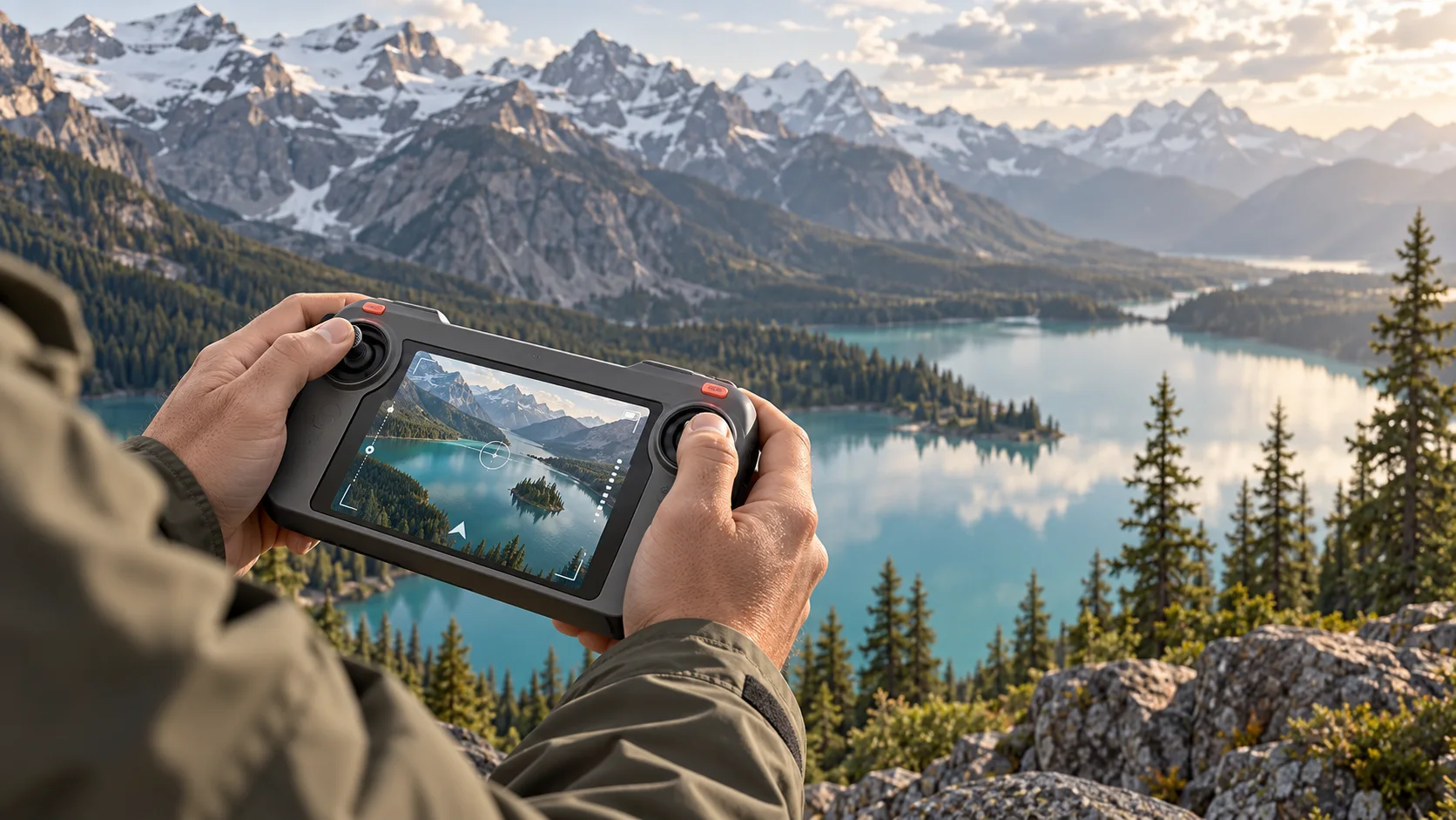
Natural light. Room in the frame.
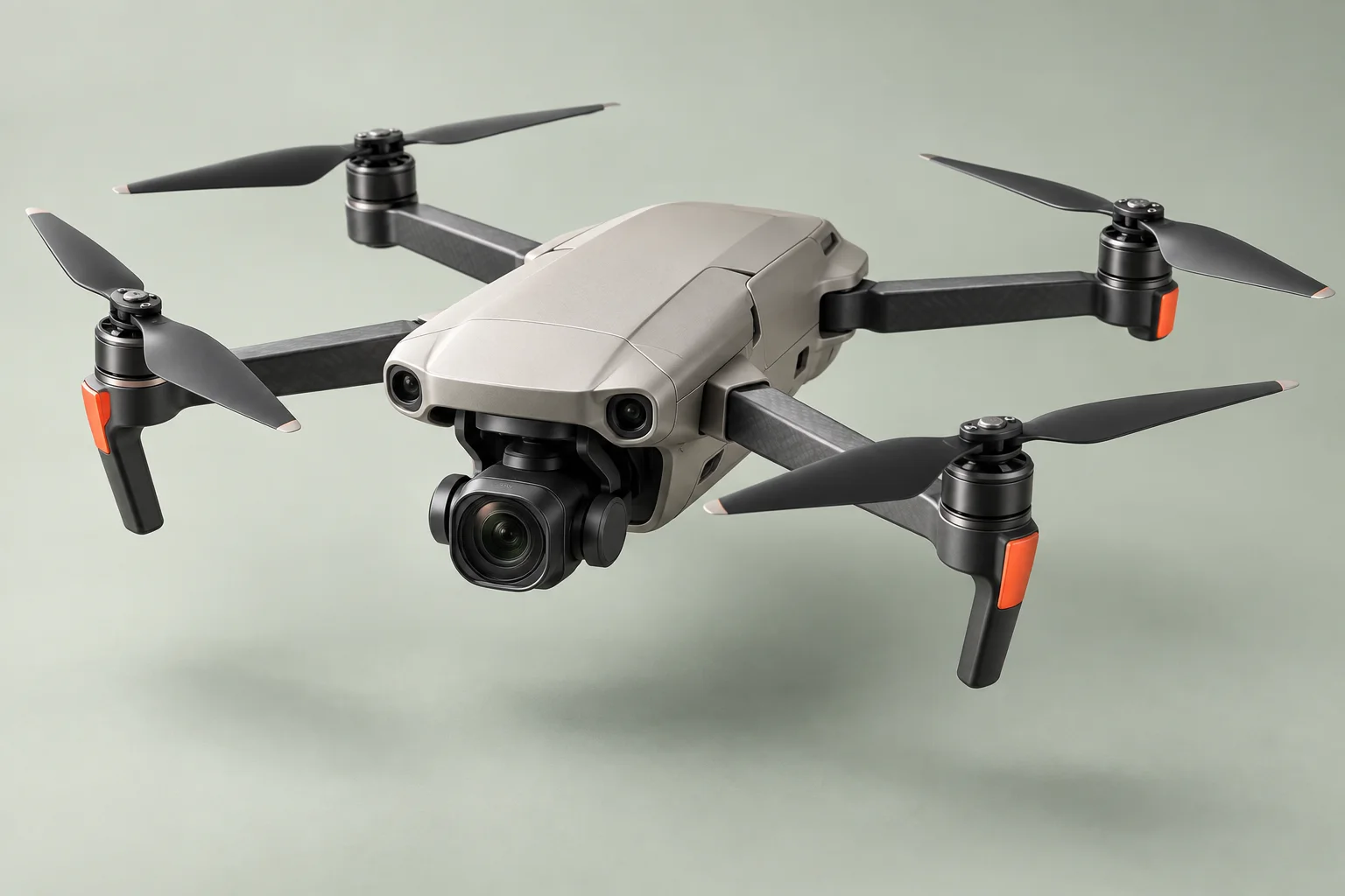
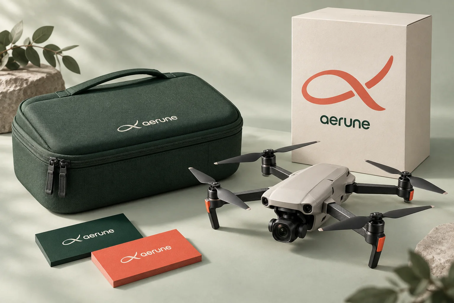
A balance of precise product detail and human experience.

Purposeful.
Never in a hurry.
Movement follows the thought. A mask opens to a new view. A line reveals as it comes into focus. Every transition gives the next idea room to arrive.
A soft upward reveal, shaped by the flight mark.
A gentle line stagger. One thought at a time.
An eight-second flight, linked frame by frame to your movement. Still when you are.
Reduced motion respects the viewer’s preference.
Ready for
the next perspective.
The logo, guidelines, design tokens, campaign imagery and editable website source.

Identity, art direction & digital experience
Prix Studio